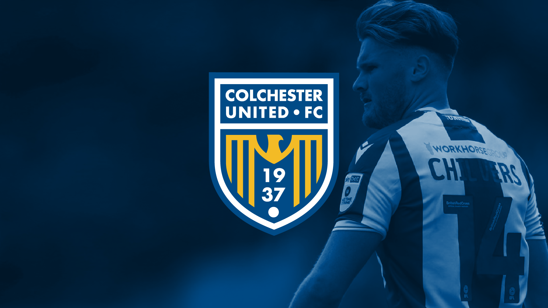
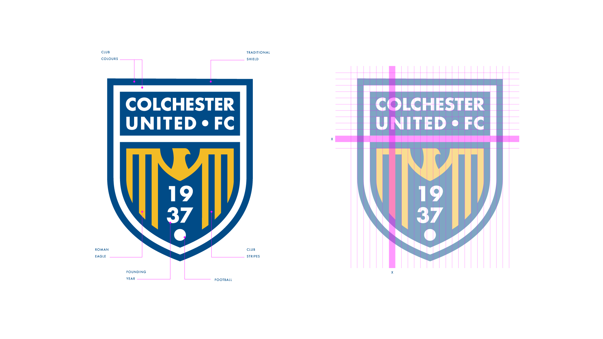
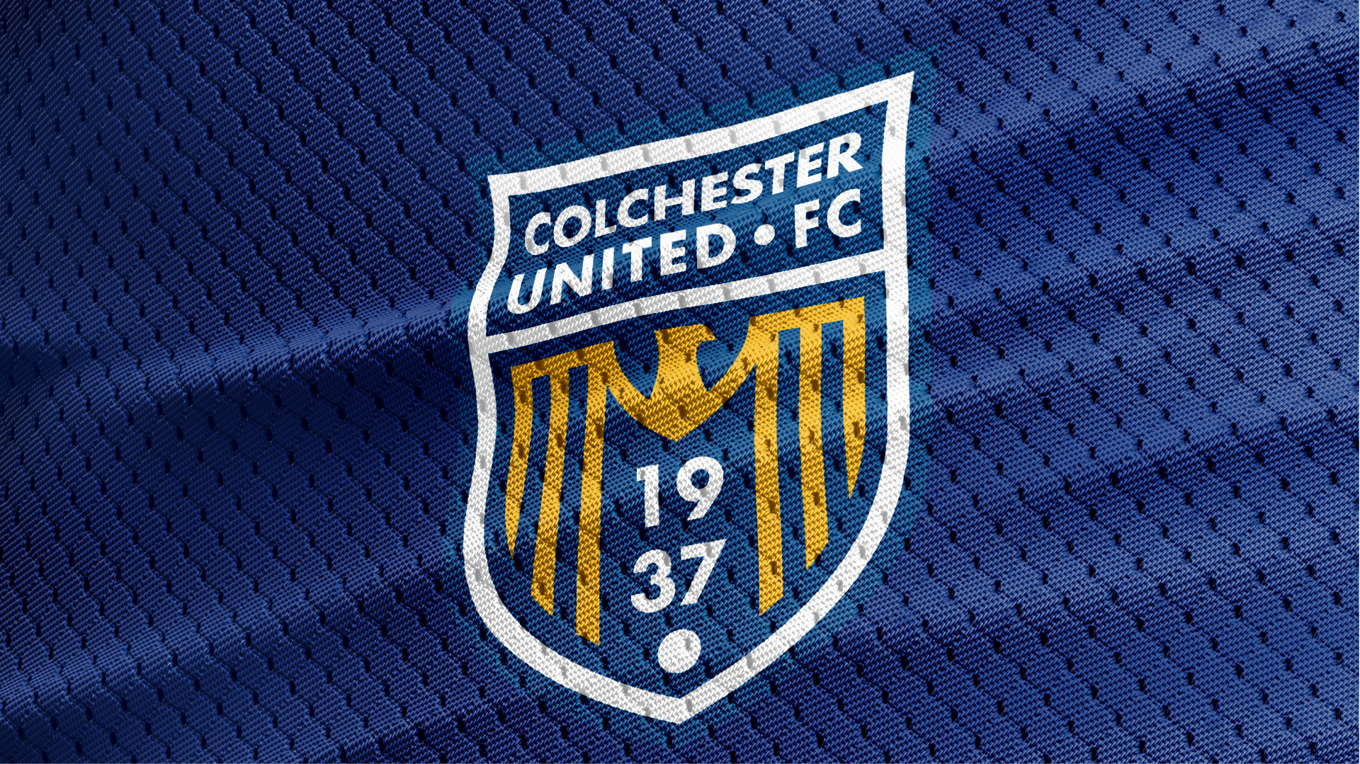
Founded in 1937, Colchester United is an EFL club with deep community roots, but its legacy visual identity can be seen to be holding it back in the modern era. This rebranding project was driven by two key insights: the existing badge was notoriously difficult to reproduce in single-colour applications, and its aesthetic had garnered an unflattering reputation within the sport, often likened by onlookers to a “squashed eagle on a windscreen.” The challenge was clear – respect the history of the club, rescue the eagle, and engineer a highly functional, modern footballing identity.
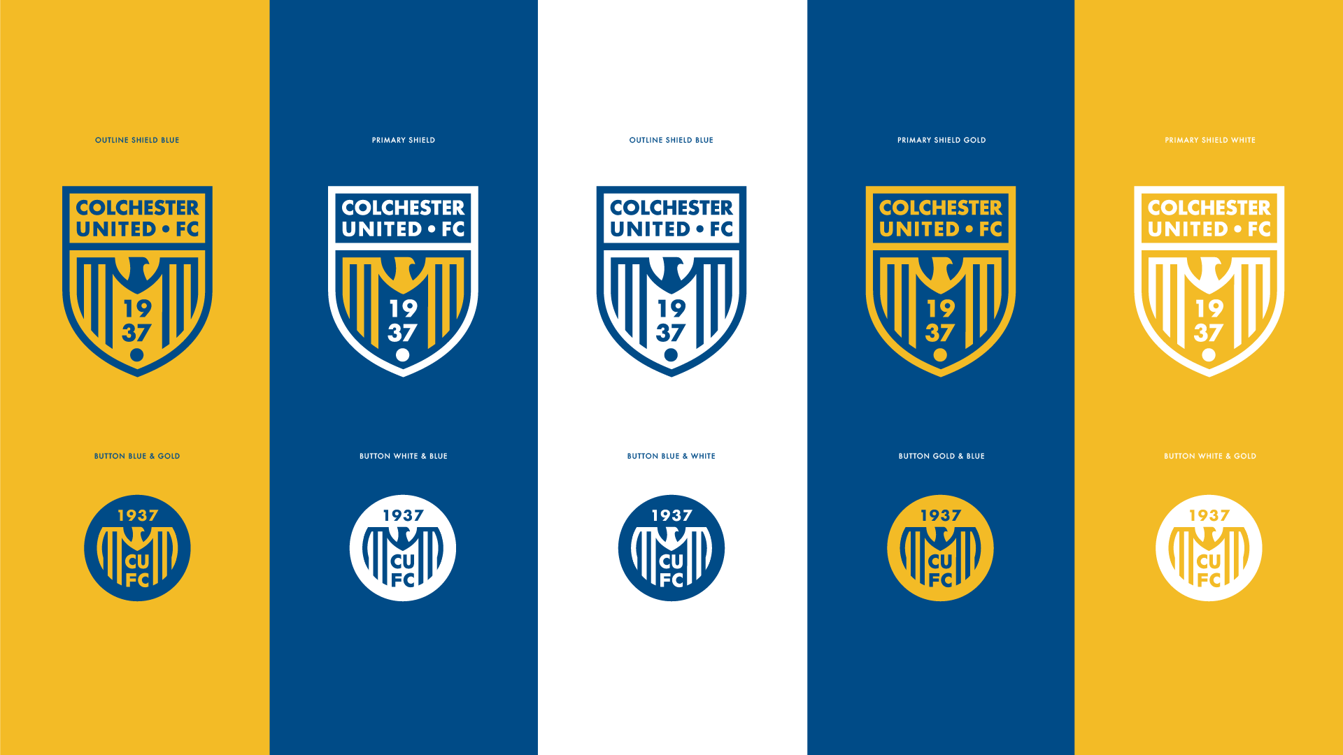
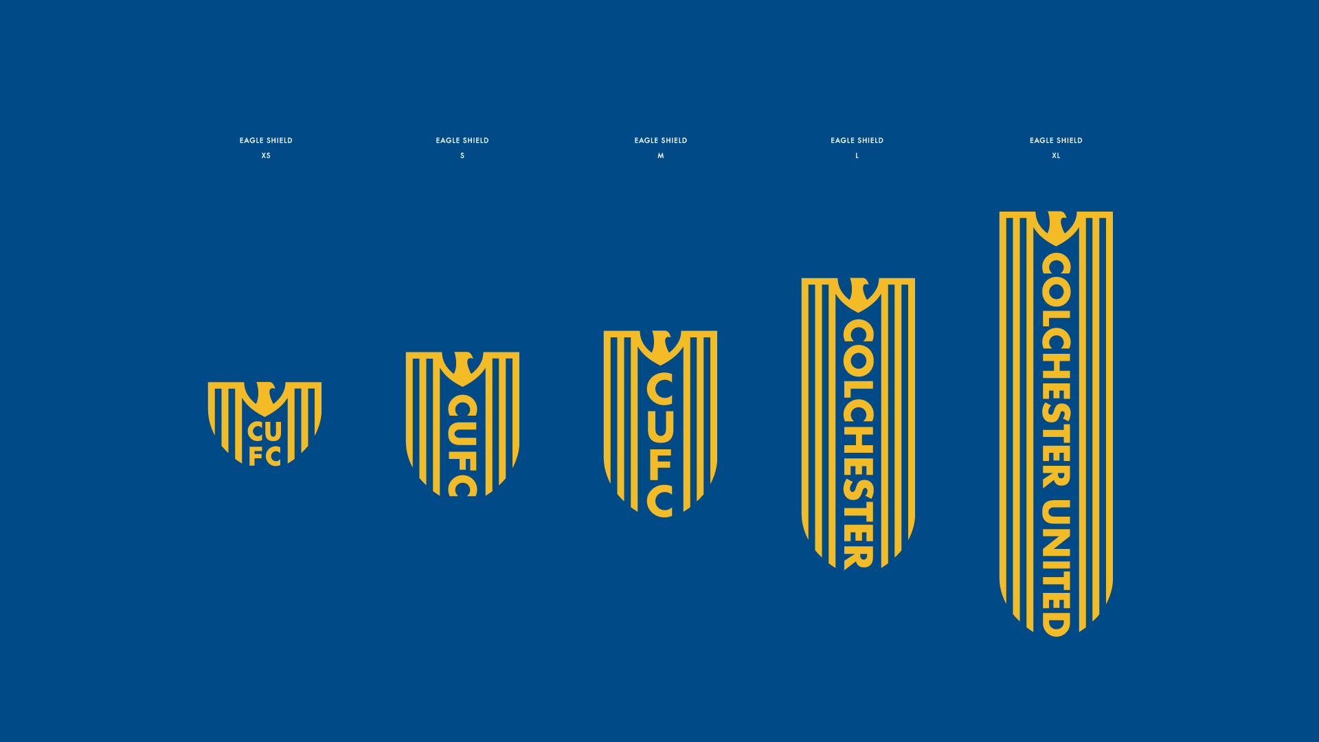
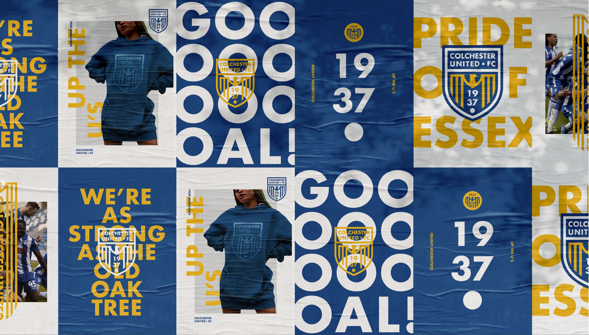
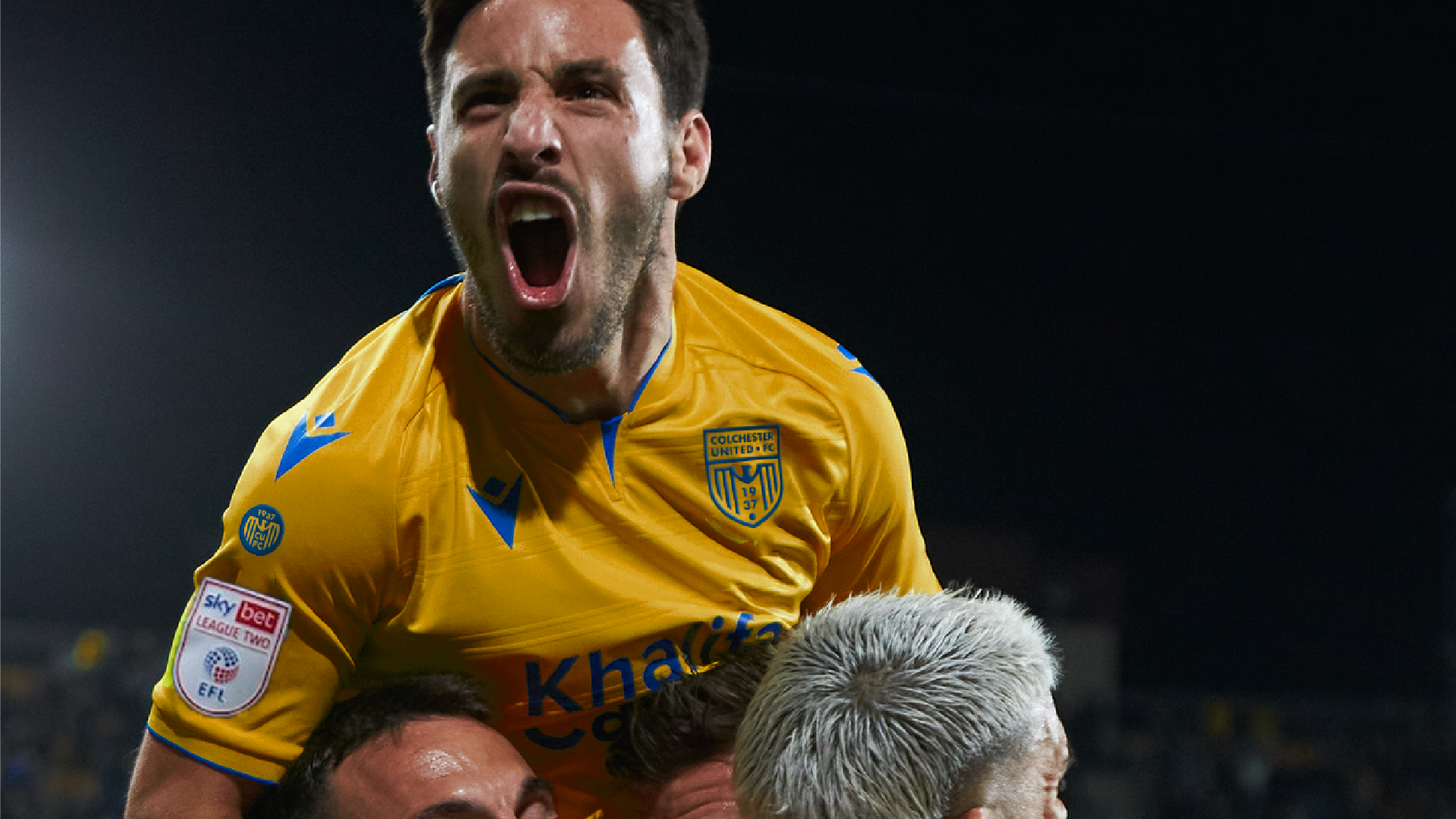
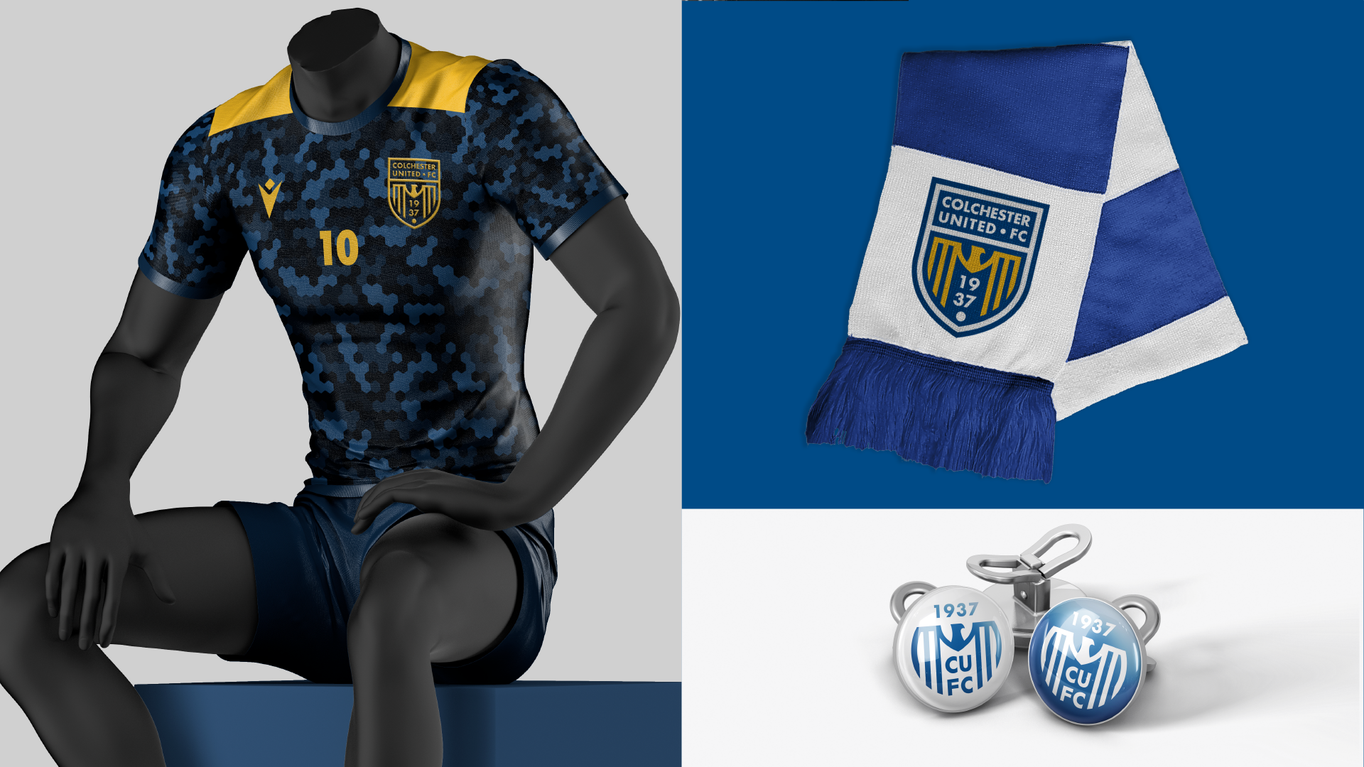
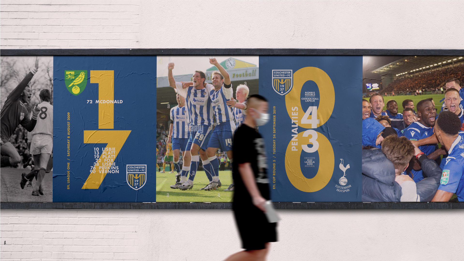
The resulting rebrand delivered a complete overhaul of the club’s visual language. At its core is a meticulously crafted new badge, designed to be bold in full colour and flawless in its single-colour applications. Beyond the primary crest, the project encompassed the creation of a robust brand ecosystem, including supporting secondary logos, button marks, and a flexible branding system. This dynamic new identity was designed for seamless application across every touchpoint of the modern football club – from team kits, posters, and social media, to corporate communications, advertising, and retail merchandise.